2018 Parade of Homes
Welcome to my annual review of the Elkhart County Parade of Homes!
Hosted by the BAEC, it’s a chance for home builders to show their work. In my mind it’s a chance for builders to distinguish themselves from other builders – is that a fair expectation? In the case of pre-purchased homes, I’m not sure it is. A lot of times the details that I really love come from a homeowner’s involvement; their decisions make the house more interesting. However, when it comes to the spec homes (not yet purchased) I do think it’s fair to compare. A few home builders have interior designers on staff, and you can REALLY tell in the spec homes which ones had an interior designer involved. To me that also translates to a builder committed to going beyond the basics. Next year when you go to the Parade my challenge to you is to try to guess which builders have an interior designer and which don’t (and I suggest limiting that guessing to the spec homes out of fairness to the builder). It’ll be fun!
There are three components to the Parade I’d like to share with you from this year’s event. First, the brand new component: ‘hard hat homes’. Second, trends I noticed. And finally, details that caught my eye in individual homes.
HARD HAT HOMES
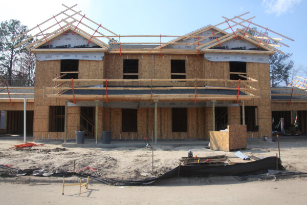
For the first time, the BAEC decided to offer a limited selection “hard hat” tour – just a few homes that were in the process of being built but not yet completed. I toured three of these. The first was a framed skeleton open to the elements and was absolutely abandoned – no builder on site! It was a strange feeling (trespassing!) since no one from the company was there, and I would have liked to ask some questions about the specific building decisions in the home…but with no one there, I obviously couldn’t do that. Womp-womp.
This photo is not the Parade home but is at a similar level of completion
The second hard hat home, from the talented Town and Country Builders, was almost fully completed. While I always enjoy seeing Town and Country’s homes, I was a little disappointed that it wasn’t really a hard hat home.
The third, from Higher Homes, was perfect! It wasn’t completed, but it was far enough along to see both some of the fundamental building elements and some of the finish components. In addition Rob (the owner of the company) took the time in advance to create large images of what the finished spaces would look like to help guests envision the finished look. He had fantastic 3D renderings he walked us through on the ipad. He partnered with Helmen Sechrist Architecture and the resulting tech he was able to provide was impressive – I think any potential homeowner would see that and realize they’d get an extremely comprehensive visual of their future home. Rob also took the time to chat about his company and the innovative way he’s structuring the cost of building along with his commitment to being personally involved with every step of the home being built. I left very impressed and excited for the future of this young company in our area. And I also thought – THAT is the way to do a hard hat home! Builders take note. 😉
TRENDS
Of course there were also 11 finished homes on the tour. Because of my schedule I only had one day to tour homes this year. I wasn’t able to see them all but I visited seven finished homes (eight if you count the Town and Country ‘hard hat home’…which I do). Here’s are the 5 trends I noticed this year:
Trend 1: WHITE TRIM
Of course! What more is there to say? Every house had white trim this year. Every. Single. one.
A spark of originality! This home from Hearth Homes was the only home with painted doors. All other homes had white doors to match their white trim.
Trend 2: TWO PANEL DOORS
5 out of 8 homes had 2 panel doors. The other houses had 3 panel, 4 panel, or 5 panel respectively. Guys, I think the 6 panel door might be officially done.
Town & Country Builders home
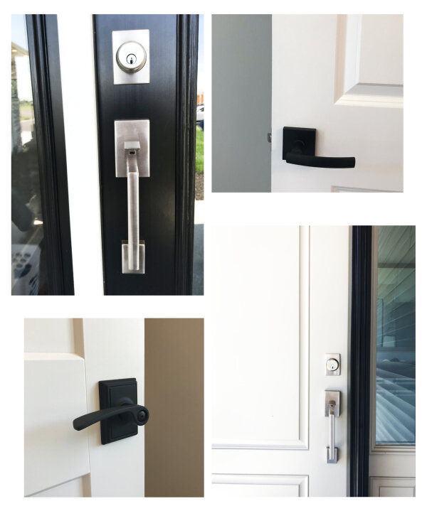
Trend 3: SQUARE HARDWARE
6 of the 8 houses had this detail in common:
Trend 4: HARDWOOD (OR HARDWOOD LOOK) THROUGHOUT THE MAIN LIVING/DINING/KITCHEN SPACE
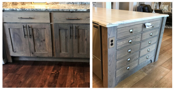
Guess how many of the homes had a different flooring in the kitchen from the wood look in the connected rooms? You’re right – NONE. It’s become completely expected that the wood flooring will run into the kitchen. This works great with painted cabinets, and sometimes it works well with wood stained cabinets. But I definitely think the cabinet color and the floor color need to be considered together. There was just one house where I felt the two were not compatible. Just keep it in mind, folks. Here’s an example of a house where it worked and a house where it didn’t…can you tell which is which?
One other side note about the wood flooring – the wood color was all over the place, but there were very few red/orange/yellow undertones. Most of the floors were a neutral brown (from light to dark) and many of them had some gray in them:
Trend 5: GRAY WALLS
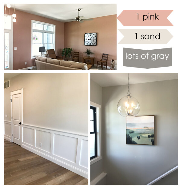
They’re not gone yet, in case you thought that trend might have died. 6 of the 8 houses had walls I’d classify as gray. One house had walls that were so light and creamy they couldn’t quite fall into the gray category, and one house was pink everywhere (yep, everywhere!).
Did any of those trends surprise you? I think the hardware similarities across the county were the most surprising to me. On to my favorite part of this post….
FAVORITE DETAILS
FIRESIDE HOMES
There was one home on the tour this year that was really really special. I give Fireside Homes the credit in making sure this home was in the Parade (thank you Fireside!!). It showcased their willingness to finish the home just as a homeowner wants – even if those finishes require a higher degree of precision and time commitment.
The bulk of the credit here goes to the homeowners, however, who fully embraced a dedication to making every detail of their home special, from the bottom to the top. I had to be extremely selective in my photos for this home, because I could have shared hundreds of special moments and totally overwhelmed the post with them. So here are a few of my favorite details of the Fireside Homes house.
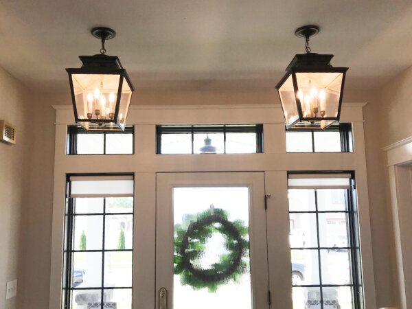
Just inside the entrance I turned around to show you some details here. The transoms are pretty common in nicer home entries, but I liked the side windows (larger than regular sidelights), and they added lovely minimal roller shades for privacy when needed. The center glass door is textured to provide a little privacy. And the double lights instead of one single was a detail I haven’t seen much.
The vanity/mirror/lighting combos throughout the home were spectacular! These were two of my favorites:
The homeowners had their own furniture throughout the home (though it all looked brand new, as thought it had been selected by a designer) and so the spaces were filled in nicely. The large window over the bed caught my eye along with the unique wall-mounted lights.
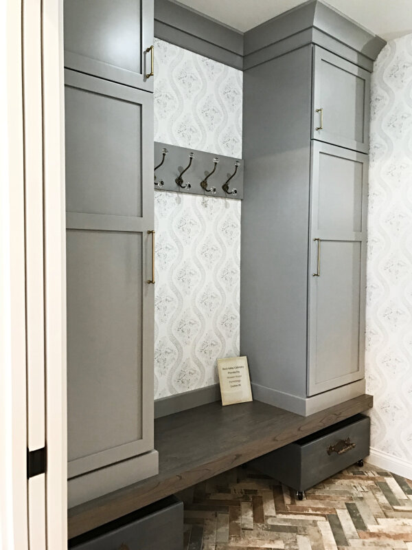
The path to the laundry room led past this little mudroom nook. The wallpaper, special hooks, roll out boxes, and rustic herringbone brick tile all add up to a lot of visual interest:
My favorite shower of the Parade was in this home. The tile work and fixtures were really beautiful. What you can’t see is that there’s a leaded glass clerestory window to the left letting in natural light. The cut out above the fixtures lets that light travel into the rest of the bathroom. And the entry to this space is just an opening – no glass to clean at all!
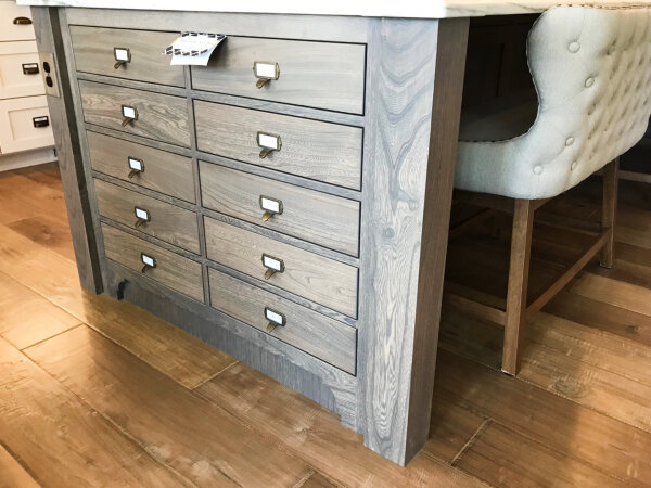
The kitchen was really beautiful, and I couldn’t get a great picture of it (too many people). I did grab this shot of the island – both ends were outfitted with these faux drawers. I love the look, but wouldn’t it be even cooler if they functioned?! Imagine little tip out drawers with just enough room for small items – maybe there would be enough space for phone chargers to be plugged in and hidden away until needed, or outlets that could be accessed when needed and hidden away when not….
There were SO many details in this home. A few of my favorites: wall mounted faucets in the master, antiqued mirrored doors off the entry, an antique newel post the clients picked up at a salvage yard in Ohio, and fantastic hardware and finishing details throughout.
I honestly think if I toured the house again I’d find a million more things to share.
I also discovered Fireside Homes has started an Instagram page. They have a beautiful picture of the kitchen. I see they’re also beginning to document a whole home build from start to finish for a super cute family. You can follow along here – I plan to!
SCHROCK HOMES
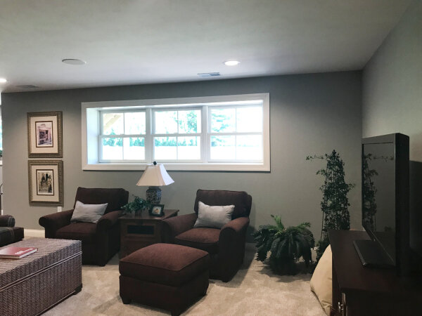
This home had one feature that was different from every other home on the tour, and it wasn’t a décor or design difference. It was elevation. Schrock was able to build this home so that the basement was partially above grade. This is not a new concept, but I was struck by how much more pleasant the basement is with all that light streaming in. None of the other homes on the tour had the same feeling down in the basement. I’m including it as a reminder to myself, for that far off day when I build a custom home:
HEARTH HOME:
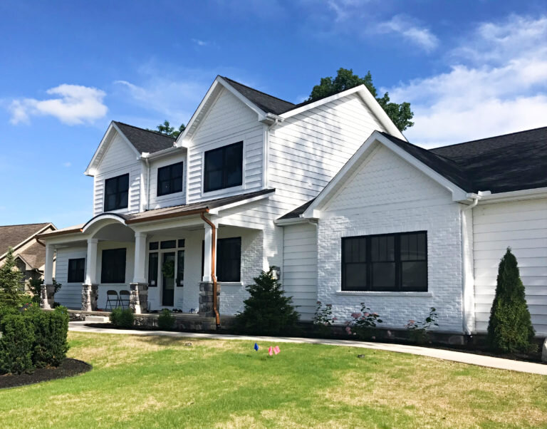
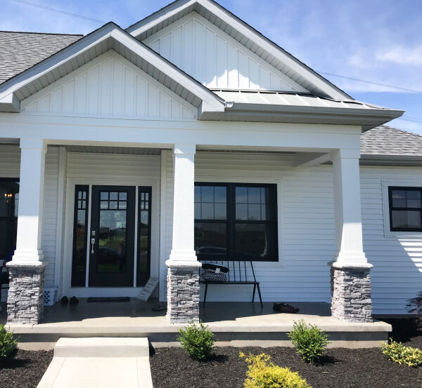
I loved the exterior of this home. The board and batten detail in the peaks, the gray stone, the black windows – it all works.
The entry wall was so well done! Simple molding really elevated it from builder basic to something special:
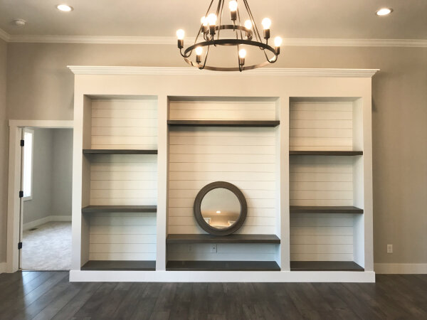
Almost every parade home has a fireplace focal point wall – I hardly ever photograph them any more because I’m so used to seeing them. But this one caught my eye – it was my favorite fireplace wall on the tour this year. Why? The top area behind the tv has moldings that tie into the entry nearby, the white brick adds great texture, the fireplace itself is extra wide (which balances out that black box on top so much better than the standard fire box), and I love the way the mantel turns the corner and continues as shelving. It feels modern and fresh and is a nice change of pace from the ‘rustic beam’ mantel we’ve seen so much recently.
Finally, this nook in the kitchen was so cute:
M.J. CONSTRUCTION
As a designer, I tend to notice when a builder does something that I consider outdated. In many of the homes this year I noticed that builders added 4” splash guards behind the countertops in both bathrooms and kitchens – why??? I bring it up because in this bathroom I saw the backsplash handled differently, and thought I’d share.
The backsplash is just a 1” piece of countertop material. It still keeps water from getting to the wall, but it’s much more subtle and less clunky than a 4” splash. I also think it feels contemporary, which really suits the other decisions made in this particular bathroom. What do you think? Do you prefer this over a 4” splash or do you think it would be better to skip it altogether?
Side note: there was one home with a GOOD 4” splash, and it was in the Fireside Homes master bathroom. The way it was cut makes it look antique and special; perfectly suited to the rest of the space:
Fireside Homes
KLINE CUSTOM HOMES
The garage doors were very striking! Don’t you think they look sharp with that siding, stone, and the black accents?
The hall bath had a simple gray subway tile that looked really nice:
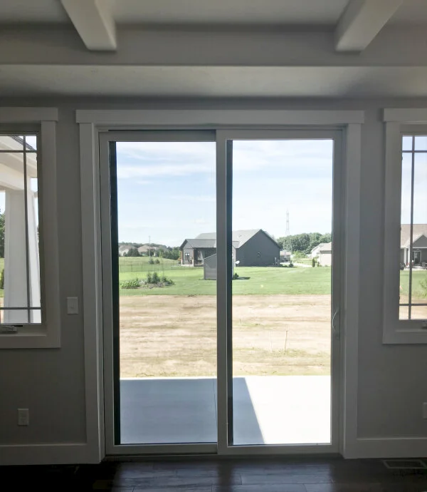
It’s a little hard to tell in this image, but the builder used an extra-tall sliding door. I wonder if this would cost less than a slider with a transom above, while still providing more light than a standard sliding door:
DAVE MARK CONSTRUCTION
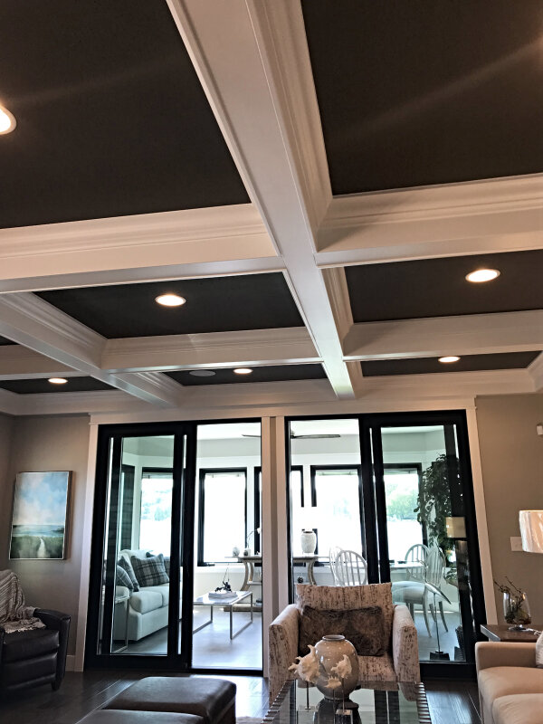
Several homes had coffered ceilings, but these were the best on the tour. The dark paint inside combined with the thick moldings really made them special.
I loved the textured glass on the shower door if you want light with privacy (and perhaps the glass wouldn’t need to be cleaned as often):
The basement bar had a pretty little copper sink that caught my eye:
And I found a cool appliance there as well – an ice machine!
TOWN & COUNTRY BUILDERS
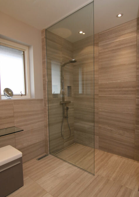
This shower isn’t the most incredible master shower on the tour (the winner of that contest goes to the Fireside Homes master shower that I showed you earlier!), but I share it because the door-less entry is so nice and the window in the shower offers wonderful natural light. Things to consider when planning your new shower!
Side note: I’ve been waiting to see a true curbless shower at our Parade of Homes. I really love curbless showers! If you’re saying “who cares??” right now, read this article and perhaps you’ll begin to agree with me! And if aren’t sure what a curbless shower looks like, here’s an example below (NOT from our Parade of Homes):
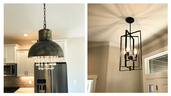
Back to the Town & Country home. Some of the lighting choices caught my eye:
And I noticed the flooring in the mudroom was a rustic brick. Such a pretty compliment to the shiplap, wood tones in the seat and gray sink base:
If you’re still reading at this point, I’m happy to announce you’ve made it to the end! Whew!
I didn’t get the chance to walk through the homes offered by Miller Brothers Builders, Straight Talk Construction, Team Construction, or Allen Edwin Homes. Sorry guys, I will try to get there next year!
If you’d like to read about more pretty homes in Elkhart county, check out Parade of Homes 2017 or Parade of Homes 2016.

