2019 Parade of Homes Highlights
THE 2019 PARADE OF HOMES WAS A SUCCESS!
Every year I love to compile the details that caught my eye in the parade homes. It becomes this rather random assortment of images and thoughts that I share with you. 🙂 I’d love to know if you enjoy the montage or would prefer I was more focused (just showing you all the parade kitchens, for example). I did compile a round up of the trends spotted this year – you can read that post here.
If you’re interested in seeing the layouts of each home or getting more information about the builders, check out the plan book that the Builders Association of Elkhart County (BAEC) put together for the event.
Let me start with a few sneak peeks of some hard hat homes, in case you missed them. Then I’ll get into all of the featured homes. Fair warning: this post is going to be long, but I must tell you that I’m saving my personal favorite home for last, so don’t stop reading too soon or you’ll miss the most gorgeous home of all!
HARD HAT HOMES
This is the second year the Parade has included ‘hard hat homes’. These are homes that are still under construction, and this year they were only open on the last two days of the parade. While there were eight homes in this category, I only made it to three. I thought I’d share just a few items that caught my eye from these unfinished spaces.
MILLER BROTHER BUILDERS
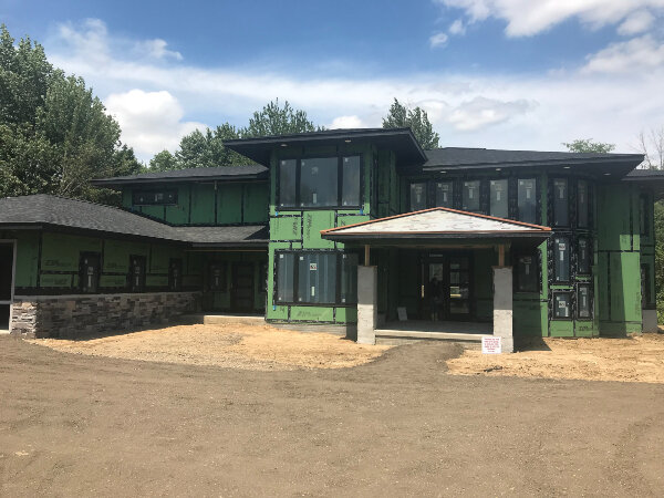
I am excited to see such a modern project coming from Miller Brother Builders! If the exterior is any indication, this is going to be a spectacular home. It has a huge steel curving staircase that stretches three stories, and some other grand features. The detail in the basement of this curved wall under construction was fun to see, and I can’t wait to come back and walk through this house when it’s done! You can see it too – it will be available to view during the Kosciusko County Parade of Homes from Sept. 27-29.
RELIANCE CONSTRUCTION
This hard hat home was a must see, at 4,500 square feet and designed by the esteemed Helman Sechrist Architecture.
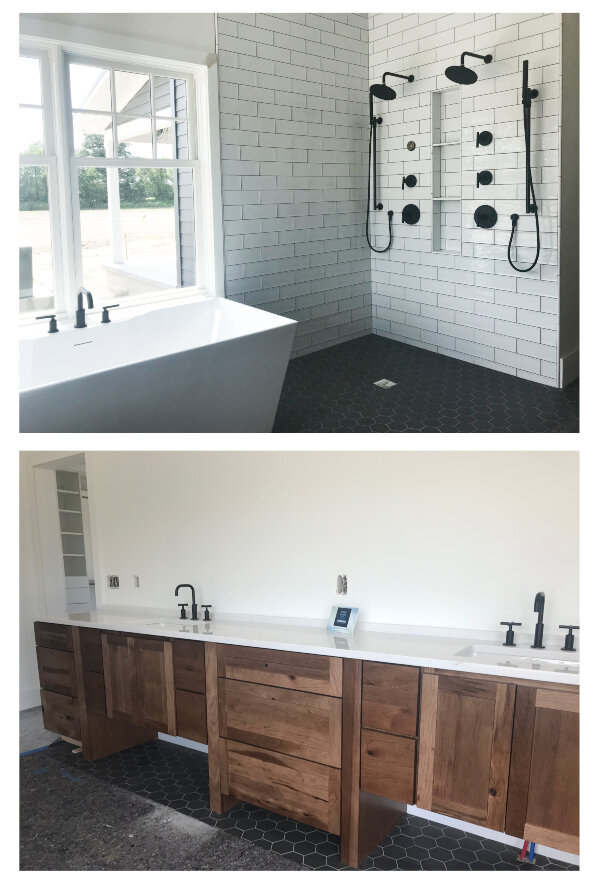
I loved a lot of the finishes in this house, but this master bath was particularly exciting.
Notice there is no shower surround! Will one be added or will this room be a wet room? I love the wide open feel, the accessibility and the lack of maintenance (no glass to clean!). But could it be a bit drafty? 😉 Across from the shower they have this massive vanity, with accessibility in mind for current or future needs. And the natural wood + subway tile + hex floor tile + matte black fixtures??! Perfection.
Another thing I loved in this home was in the basement. In the basement there was NOTHING hanging down below the ceiling level. The builders created a rafter system to carry everything. This is just incredible when you’re down there – it feels so open, and it’s one of those things I didn’t notice anywhere else. Would I have noticed this feature if the drywall was installed? Maybe not – another reason to love the hard hat homes!
Finally, I thought the layout of the basement windows was really smart. One in the living area, one in a bedroom, and since they share a corner the builder was able to install one really nice large window well that serves both windows. Genius!
I’d love to know what you thought of the hard hat homes. Did you enjoy visiting them or do you prefer to see finished spaces?
FEATURED HOMES
TEAM CONSTRUCTION
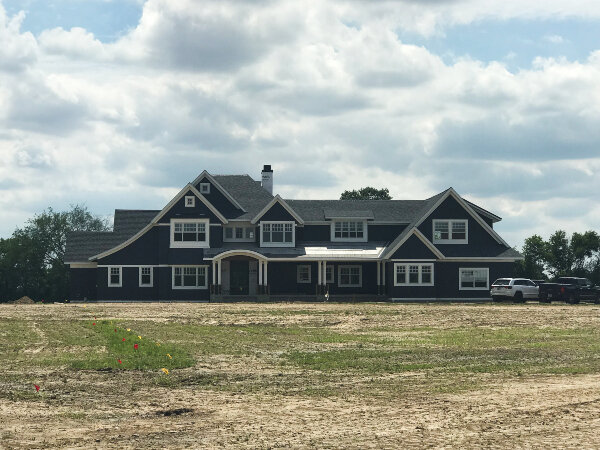
I liked the mixture of siding color, shake color, stone, and garage door style at this home:
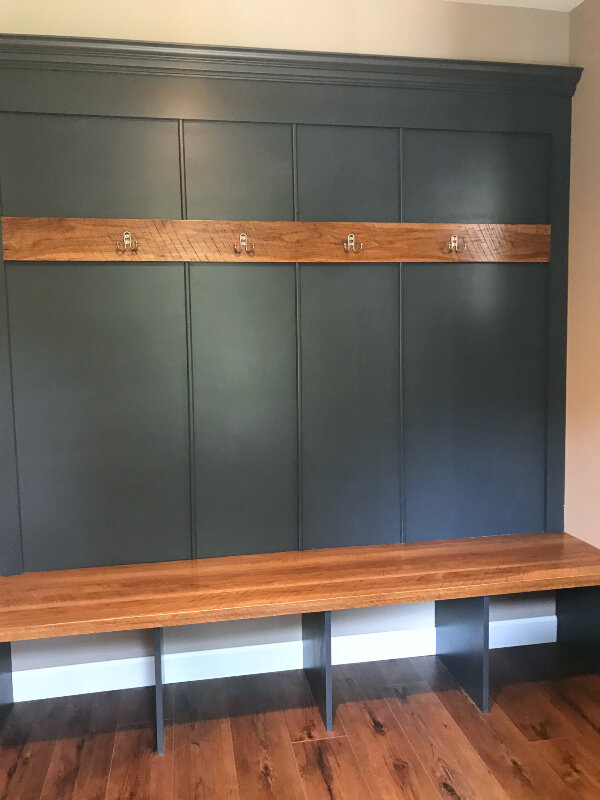
I also really liked their simple take on the mudroom bench.
Honestly, mudroom benches could be included in the list of trends (almost every new home has one now), so I usually don’t notice them anymore. Why was this different? Well, I loved the rough-sawn wood used along with the dark paint color, and I thought the trim detail was a nice way to create that mudroom bench look without the annoyance of actual dividers. I also love to DIY, and this seems like something anyone could DIY! Love that!
INSPIRED CUSTOM HOMES
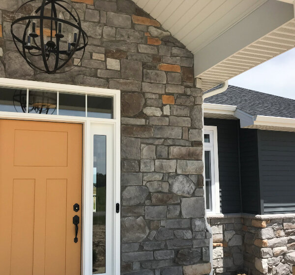
My favorite thing about this home was the beautiful yellow front door. I tried to get a shot to show how this door color tied into the stonework and the dark blue siding beyond. So lovely!
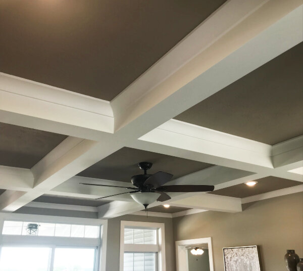
I also liked the classic coffered ceiling – an elegant upgrade that’s still clean lined and simple with that pretty cove crown.
KLINE CUSTOM HOMES
This home was ultra-contemporary in finishes. It’s the only home that didn’t have a subway tile backsplash, instead opting to run the countertop quartz up the walls. It also had matte black smooth cabinets and those striking black pendant lights:
Directly across from the kitchen was an entertainment wall that continued that sleek contemporary feel:
Finally, there were some whimsical light fixtures in this home that caught my eye:
M. J. CONSTRUCTION
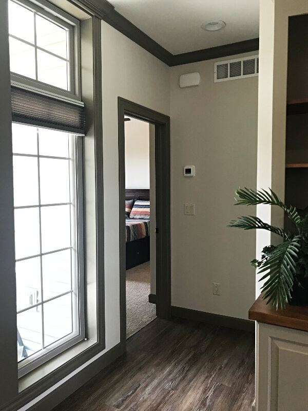
This was the one home that didn’t have white trim!
SHIPSHEWANA HOMES
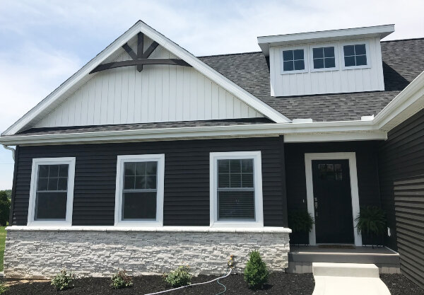
I really liked the selections out here: the white stone, vertical siding in the peak, and contrasting dark horizontal siding look sharp together:
The kitchen was also a nice departure with the navy blue base cabinets:
FIRESIDE HOMES
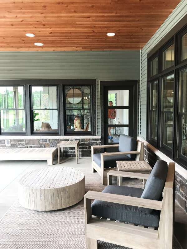
This home had one of my favorite outdoor spaces. It was nestled between the dining room and a master suite private living room, so it felt very protected. I loved the siding color with the wood-clad ceiling and the black windows.
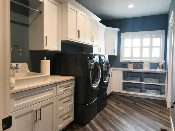
I also loved this laundry room:
And what is this room, you ask? Oh, just one wall of the giant master closet! With all of the closet built ins created locally by Closet Craft (seriously, if you ever want to to upgrade your closet they are the people to call!):
closet by: Closet Craft
TOWN & COUNTRY BUILDERS
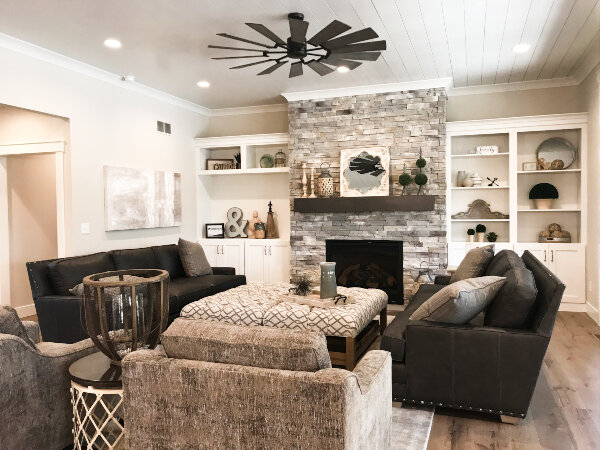
I really loved this living room. Keeping it single story gives it a charming, cozy feel, and I think the upgraded ceiling treatment and wonderful styling help too:
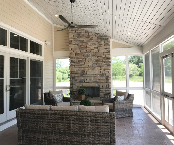
And that living space opened up to a huge screened porch. While they switched to outdoor materials for the ceiling, floors and walls, they did a wonderful job of making selections that related to the ceiling, floors and walls inside so it feels very cohesive and natural to move to this outdoor space:
The exterior of the home had a really unique profile with gothic windows being used for the second floor. I liked it from the outside…but LOVED it from the inside. Each window became a special architectural moment, adding so much character to this new home:
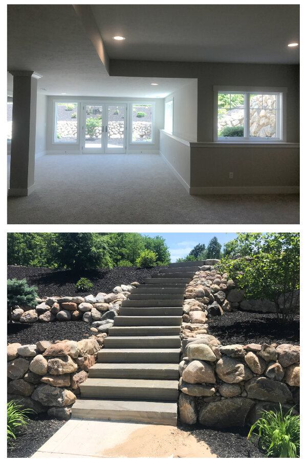
And down in the basement, they created a walk out basement in a spot that would have been underground, by excavating and landscaping a gorgeous sunken patio with stunningly beautiful stone steps leading back up the ground level.
HIGHER HOMES
We have come to the final home!! And I saved the best for last! I basically started hyperventilating when I walked into this one, guys. It is everything.
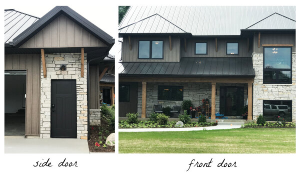
As you approach the home, the double height stacked windows caught my eye. I also loved the detail put into everything out front – even the side garage side door felt special.
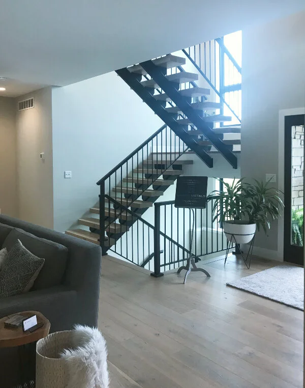
When you walk in the front door, this stunning staircase is on your right:
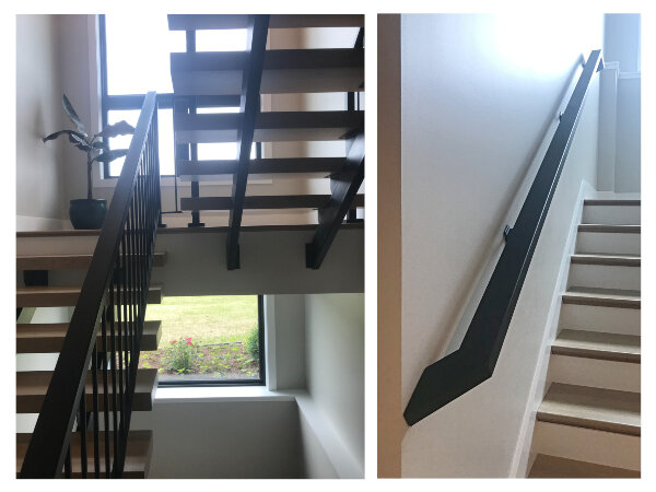
The chunky wood treads paired with the sleek metal handrails was really a show stopper. And notice the windows providing light not only above the steps but through them as well:
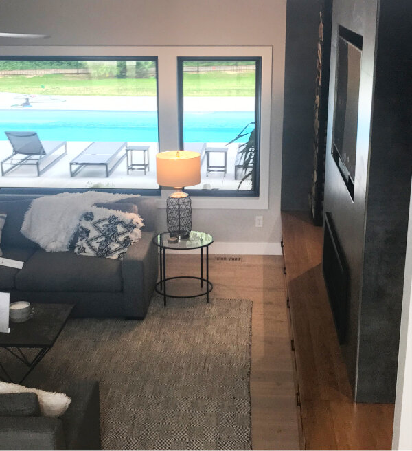
From the stair landing you get this beautiful view through the living room to the backyard and pool beyond:
Back down on the main level, the space is one large open area, but it doesn’t feel too large for family living. I actually love the way the space is laid out because the kitchen is almost tucked away, and yet it’s right there in the room. If you want to see the floor plan, go to the BAEC online book and look on page 13. You’ll see what I mean.
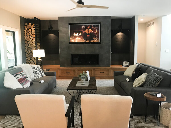
Back to the living room. This modern entertainment wall is SO GOOD:
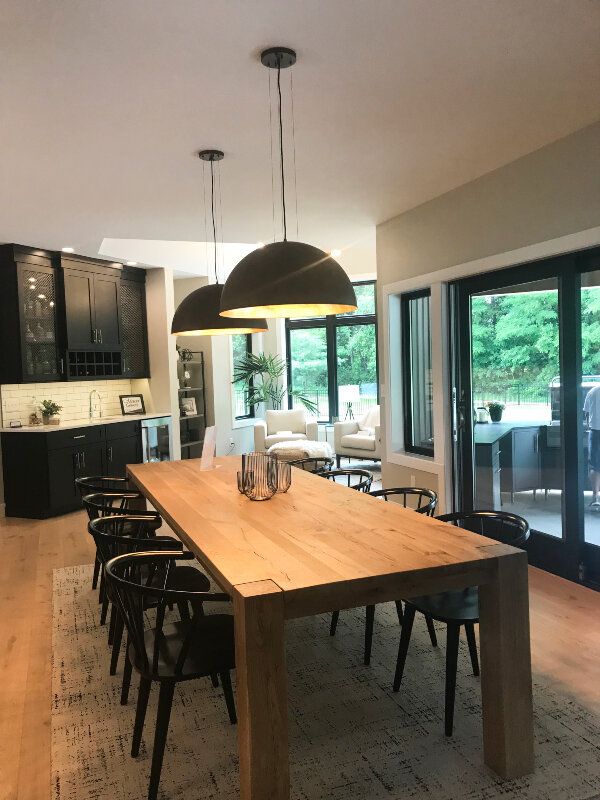
And directly behind the living area is the dining space:
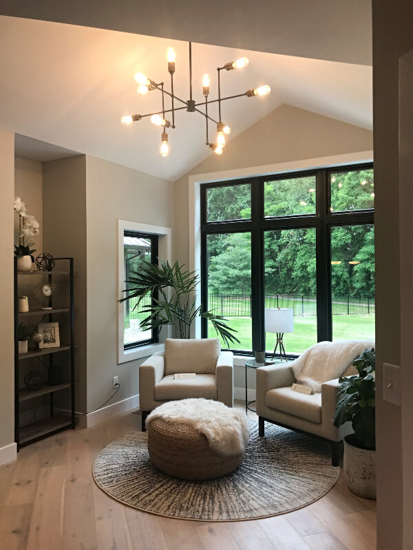
Beyond the dining space you’re seeing the black bar cabinets, and to the right of that is a special little reading nook with a vaulted ceiling and light streaming in on all sides.
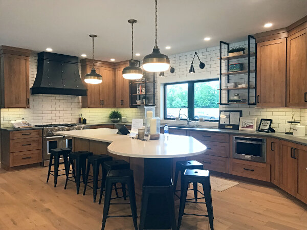
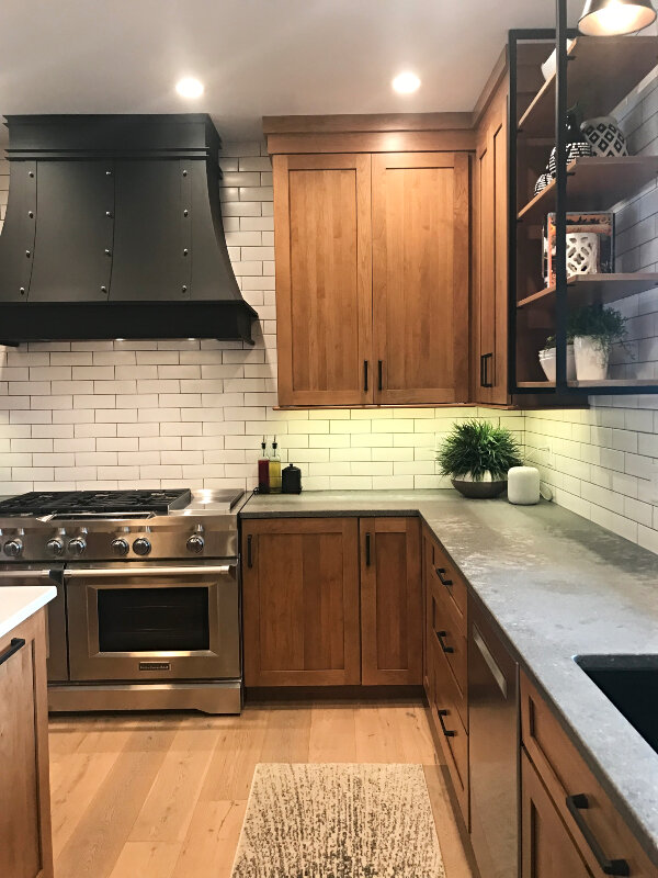
Directly behind this area is the kitchen. So let me spin around… TA DA:
I love it so much. I love the matte black hood and how it ties into the industrial open shelving, black hardware, and light fixtures. I love the natural wood cabinets with the crisp white subway tile (that runs all the way to the ceiling on all walls). I love the perimeter countertops, which are a leathered quartz that looks and feels like concrete. I love the undercounter microwave. I love the flat crown treatment and full overlay cabinets. I love the massive amount of storage (plus there’s a huge walk in pantry around the corner). I love the seating for 8(!) at the island. I love how the wood tones of the flooring work with the wood tones of the cabinets (not an easy feat, my friends).
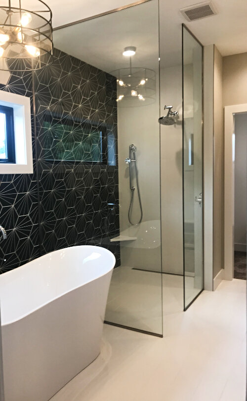
I could go on and on, but I will exercise great restraint and walk away from this space and show you a few other items that caught my eye. The master bathroom had a ZERO ENTRY SHOWER!
The homeowners had fun with the tile:
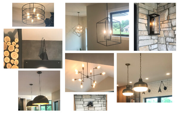
And I really loved every single light in the home (here are a few):
I know I have to stop. This post is ginormous. I could go on and on and show you the two laundry rooms (main level and second floor), huge mudroom, beautiful little office spaces, full basement, custom master closet (with Closet Craft closet system, of course!), but we’d be here all day! So I’m going to stop there and let you imagine. Maybe Higher Homes has posted a few more images of the house on their Facebook page.
THANK YOU for following along with this post of highlights from the 2019 Parade of Homes! It’s so fun to share it with you. If you’re interested in reading about some of the trends spotted in this year’s parade you can read more in this post: 2019 Parade of Homes Trends.
Again, If you’re interested in seeing the layouts of each home or getting more information about the builders, check out the plan book that the Builders Association of Elkhart County (BAEC) put together for the event.
Finally, if YOU are building or renovating a home and you could use some assistance with layout, selections, colors, design or decor… I would be honored to assist you in making your home look as lovely as any parade home! 😀 You can read more about Red Door Design here or contact me anytime.

