2017 Parade of Homes
The 2017 Parade of Homes has come to an end, and I am excited to share some highlights and trends spotted this year!
TRENDS 2017
First of all, I noticed that this year’s parade felt a little smaller. Smaller in the number of houses participating, and also in the general sizes of the homes. I made it to nine of the twelve homes – and saw eight of those in one afternoon! A few common details were the craftsman style exteriors. That is SO popular right now:
Another trend was the choice of flooring – medium toned flooring with a ‘rustic’ finish was very popular:
Of course lighting was beautiful, and I was really remiss and only took pictures of a few of the light fixtures:
And this year I noticed that many kitchens had white perimeter cabinets and a dark island. Interesting!
There were some other trends, but since they really haven’t changed much since last year, I won’t go on. In retrospect I would say Trend #3 from last year was missing this year (which was a bummer).
Now for the fun part – highlights that caught my eye! I have images to share from homes 2, 4, 5, 8, 11, and 12. Disclaimer: I am sure there were lovely details in the other homes too, but I either didn’t get to tour them or forgot to get pictures!
HOUSE #2 – K.W. YODER CONSTRUCTION
This home had some of the most fun finish decisions. The powder room went bold with this geometric wallpaper and black ceiling:
The ceilings in the main living area were beautifully coffered (and painting the recesses gray really set off the beams):
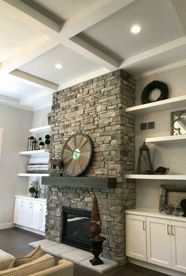
Another shot of the living room: this time of the lovely stone used on the fireplace, and the built-ins flanking it:
The kitchen was beautiful. One detail this builder always includes is power under the cabinets, so no outlets interrupt the backsplash:
Attention to detail made it into the secondary bedrooms too, like the upgraded light fixture and pretty wallpaper in this room:
The laundry room even had some special touches: the door was a beautiful beaded glass (letting light from the window flow out into the back hallway – smart!):
And last, but not least… this little nook under the stairs was turned into a doggy den. How adorable is that?
HOUSE #4: NUGENT BUILDERS INC.
I’m guessing this house was probably the home that got the most ‘buzz’ this year. Before I even walked in I loved it. The porch was a nice departure from the others with that beautiful peaked roofline. And it was a little foreshadowing to what was inside – the kitchen/dining/living space was one huge vaulted room with a wall of windows looking over a lake. Beautiful!
This house won ‘best laundry room’ in my book:
The kitchen was so lovely, with two islands (you can only see the taller one in the photo below – there is a second between the blue backsplash wall and the dark stained island):
I appreciated the beautiful upgraded natural stone finishes, from the granite counters to the pebble in the showers – perfect for a lake home:
And the outside of the home featured a gorgeous deck looking over the water and beautiful landscaping! I love those giant stone slabs placed as steps:
There was so much more that impressed me in this home – I just couldn’t capture it all!
HOUSE #5: TOWN & COUNTRY BUILDERS
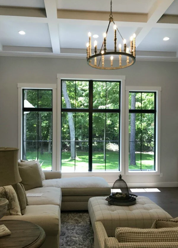
The first thing that caught my eye were the gorgeous black windows. If there was one thing from this year’s Parade that I want, it’s those! All the heart eyes!
The lovely living room fireplace:
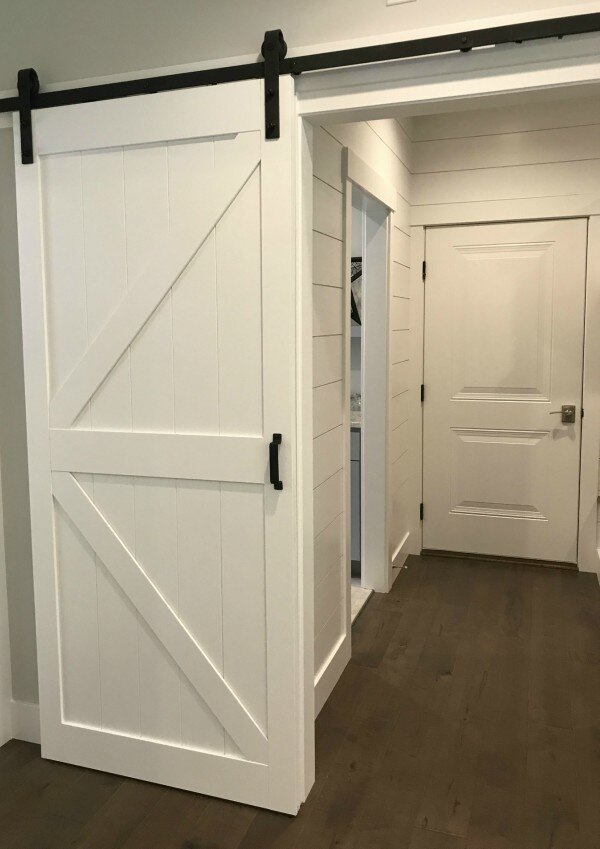
Barn doors were still used in several homes, and I liked that in this application there was white shiplap in the next room. That helped the sliding barn door feel at home and not out of place:
And this home had shiplap in a few other places too – the dining room ceiling, master bath, and master bedroom ceiling detail were a few spots that really felt special. Beautiful!
HOUSE #8: FIRESIDE HOMES
These floor tiles in the front guest bath caught my eye with their interesting metallic look:
Bruce liked this kitchen best. Maybe all the dark cabinetry felt more masculine? Or maybe just because it was striking, and a nice visual departure from the white cabinets in every other kitchen:
I thought the wood on this double vanity from Hoosier House Furnishings was really lovely:
And finally, this interesting charred wood wall was installed in the basement to separate a workout room from a yoga room:
HOUSE #11: TEAM CONSTRUCTION
In the master shower the builder created a ledge all the way across the wall. The choices in tile both emphasized and integrated this space, and it seems much more functional than the shallow little nooks or corner shelves I saw in most master showers:
HOUSE #12: SCHROCK HOMES
This was another lovely porch:
The combination of colors on the exterior seemed so inviting too:
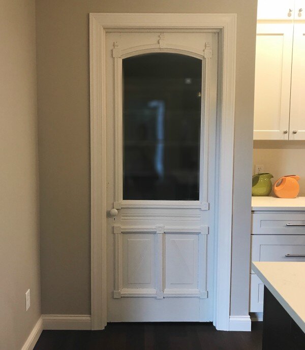
The pantry had a beautiful old door. The touch of antique in the midst of all the new finishes added warmth and character:
Whew – that was a lot, and yet I can think of so many wonderful details I missed when taking pictures. Next year I will. do. better. In the meantime, if want to see more pictures of beautiful homes from our area, you can check out my 2016 Parade Highlights post.


