Staging a Modern Traditional Kitchen
July 9, 2017
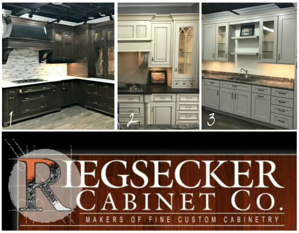
Last month I was invited to stage not one, not two, but three kitchens!
They are all located in one space – the new showroom of the Riegsecker Cabinet Company. And they are beautiful!
The goal of this project was to add unique finishing touches to each kitchen to make it even more visually appealing and distinctive, without distracting from the beautiful cabinetry itself. My hope is that a visitor walking into the Riegsecker showroom will perhaps not even consciously notice these details, but will instinctively love the kitchens on display!
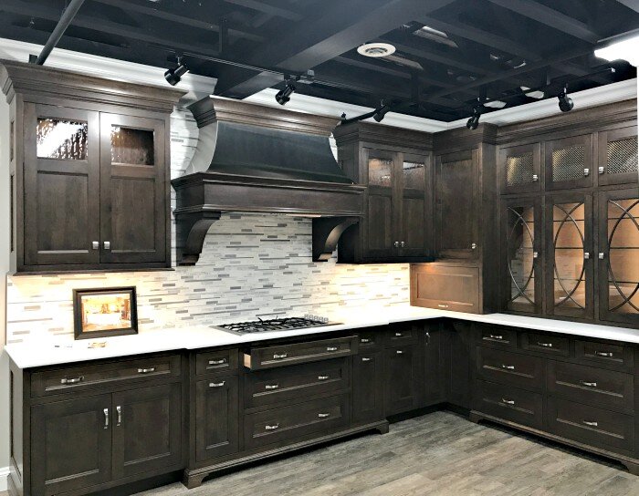
Once I started writing this post I realized if I share all three kitchens in one post it would be gigantic. So come back tomorrow for kitchens 2 and 3. Today I’m sharing the first kitchen you see when you walk into the showroom:
I’m calling it the Modern Traditional. It has some modern touches such as white quartz countertops and that mixed materials backsplash, but the dark wood tones, detailing in the door profiles, and beautiful trim work on the glass cabinet fronts are all traditional.
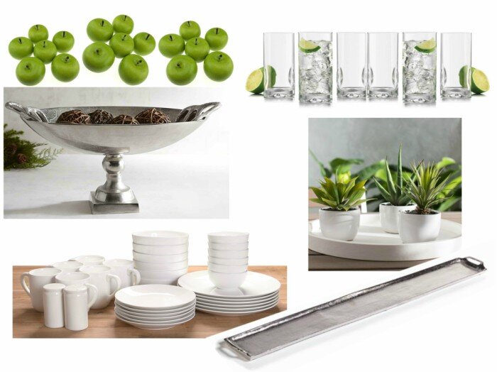
As I sat down to start shopping, I knew one thing this kitchen needed was a pop of color. I went with apple green, with some traditional silver touches for elegance. The silver tray would run down the island with succulent planters on top – a low profile modern pop of color that wouldn’t block the view to the cabinets beyond. The large silver bowl would be piled full of green apples on the counter next to the stove. Those beautiful glass doors didn’t need anything competing within, so simple white dinnerware and clear glassware were chosen to fill it best. My product selection for this kitchen looked like this:
Until…my client emailed me with a new detail. Unbeknownst to me, several ladies in the shop had been working together to choose barstools for the island, and they settled on this:
I am SO glad I was informed about that decision, because the green accent color wouldn’t have worked with the blue on those barstools. Side note: Can I just say how fun it was to have a design twist like that thrown into the mix? I loved it! It felt like one of those moments in the old design shows, where a contestant gets halfway through completion of a room and then the judge comes back in and says “…but there’s a twist! You must incorporate the elements in this pillow…
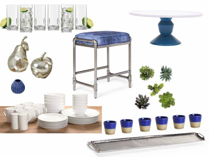
So, with the image of the barstool as a reference, I tweaked the design:
I still wanted my silver tray of succulents, so I found blue containers and faux succulents and assembled my own planters.
The counter décor was a bigger issue. I couldn’t replace green apples with blue apples, so I looked into silver and white apples. These were available in larger, pricier varieties – not an option to fill a bowl. And a silver bowl with silver apples wouldn’t have worked anyway. So instead I found a cake stand with a pop of blue, and some beautiful larger scale silver fruit.
The beautiful glass cabinetry got some simple white dinnerware and clear glassware. I didn’t want to distract from the detail on the doors:
When it was all done, I was pleased with how it came out. The décor doesn’t distract from the kitchen itself, yet adds a bit of sparkle and color that was needed to tie into the stools. But it was missing something….
The island hadn’t been installed when I originally viewed the space, and when I went back for staging one of the designers on staff pointed out the open shelf. So I made a trip to The Depot (a thrift shop in Goshen) and picked up every single used cookbook I could find that had a blue or neutral cover. While I was there I also snagged a blue and white dish that was too perfect to pass up! Then I made a second trip back to the showroom just to add those to the space, and I was able to call this kitchen done!
photo courtesy Mindy Welty
Though I do wonder about those empty upper cabinets. Don’t you think one large blue vessel in each spot would look pretty beautiful? Something like one of these:
Maybe adding yet more blue (and more ‘stuff’) is just not needed, though. What do you think?
So that’s the staging of a modern traditional kitchen! Come back tomorrow to read about how I staged an ‘old-world’ kitchen and a ‘rustic contemporary’ kitchen. And I encourage you to swing through Riegsecker Cabinet Co.’s showroom the next time you’re at the Davis Mercantile. The kitchen looks even prettier in person!


