Kitchen Staging for Riegsecker Cabinet Co.
July 10, 2017
Today I’m back to share two more kitchen staging projects with you!
They are both located in one space – the new showroom of the Riegsecker Cabinet Company.
The goal of this project was to add unique finishing touches to each kitchen to make it even more visually appealing and distinctive, without distracting from the beautiful cabinetry itself. My hope is that a visitor walking into the Riegsecker showroom will perhaps not even consciously notice these details, but will instinctively love the kitchens on display!
Yesterday I shared the styling of a beautiful Modern Traditional kitchen. Today I’m sharing how I staged a kitchen I’m calling Old World Traditional, and another I dubbed Rustic Contemporary.
OLD WORLD TRADITIONAL
So what makes it ‘Old World’? First of all, this kitchen has a beautiful aged look with way the paint finish was applied. In addition, the trim on the glass cabinet doors references classic window detailing from time gone by, and the mirrored backs of the cabinets have a stunning antiqued mercury finish. It’s hard to tell from pictures, but even the glass in the doors is a wavy glass instead of plain glass, giving them the feel of age and history. And the hardware is perfectly old world too!
But this kitchen also has traditional elements: the chunky corbels under the range hood, the furniture legs, the moldings and the perfect symmetry:
This kitchen is really full of beautiful detailing! With all of this in mind, here are the products I pulled together for this kitchen:
The glass fronted cabinets are filled with glass dinnerware and wine glasses. I definitely want people to appreciate that gorgeous mirrored back, and don’t want anything on the shelves to impede the view. Each glass cabinet also gets a mercury urn. These cabinets sparkle from top to bottom thanks to the antiqued mirror, wavy glass and interior lighting. So pretty!
Down on the counter two traditional topiaries flank the stove to keep that symmetry going, and a classic teakettle on the stove completes the look.
And here is the whole kitchen, staged:
If you’re thinking this staging seems a little on the lightweight side, I agree. The kitchen itself has so much visually going on, I felt it was important to keep the ‘stuff’ to a minimum.
But in the next kitchen I felt no such compulsions….
RUSTIC CONTEMPORARY
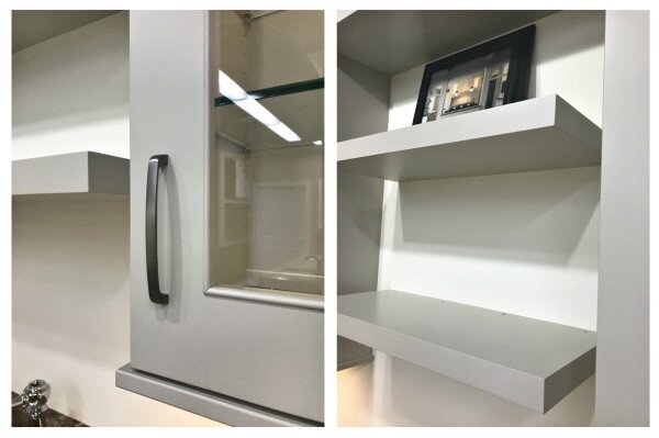
At first glance, you might think this kitchen is only contemporary and wonder where the ‘rustic’ comes in. After all, it has clean lines with those full overlay cabinets, the pinstripe door profile trim, and the contemporary hardware. Those floating shelves are definitely a contemporary kitchen trend, and even the color is right on trend (hitting that sweet spot between gray and beige – the perfect ‘greige’).
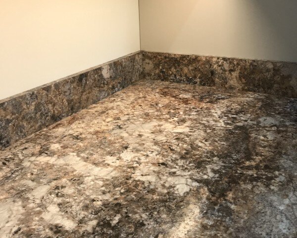
But a few details threw it into the ‘rustic’ category for me. First, the countertops. All of those warm tones and movement require complementary accessories! Can you imagine how wrong silver and periwinkle blue would look here?
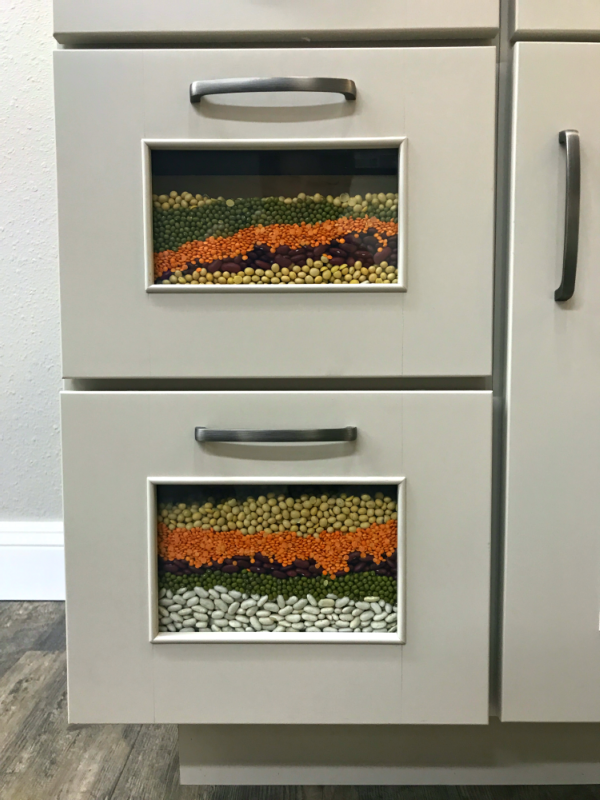
Second, the display bins. While they’re a nice custom detail, they require a filler…and since dried beans or pastas are usually the go-to filler, the look goes rustic really fast. Sure, I could have filled these with candy or something fun…but remember that this is a showroom with a lot of people walking through. We want something visually beautiful but not worth stuffing their pockets with. 😉
So – here are the rustic contemporary products I pulled together for this kitchen:
It’s a lot more stuff than the old world kitchen, but that’s because not only are there glass cabinets to style but also those floating shelves. And I felt a rustic kitchen should feel a little more layered.
The glass cabinets are filled with white dinnerware and glassware. It’s contemporary – but a hint of green in the glassware and the subtle texture on the dinnerware help keep the look from going too slick and modern.
The countertops get a bit more color, with a wooden bowl of pears, a copper canister of wooden utensils, and a beautiful vessel.
And the floating shelves have a few cookbooks, another one of those gorgeous vessels, a bit of greenery, and more copper and wood.
The bins are filled with dried beans in colors that work with the pears and apples above.
This is a perfect example of how the right accessories can pull elements of a space together and help define it.
Now might I suggest you go visit the showroom in person if you’re shopping for a new kitchen? The staff at Riegsecker Cabinet Co. really are the nicest people, and the location in the Davis Mercantile in Shipshewana is incredibly charming – full of fun shops you can check out after admiring my staging work in person. 😉


