Green House: Kitchen Plan
August 1, 2016
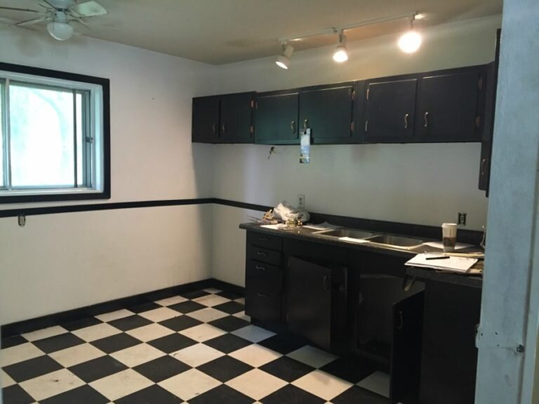
From the moment I walked into the house and looked at the kitchen I knew the plan.
No. Nope. Nu-uh. THAT ugliness right there was NOT the plan.
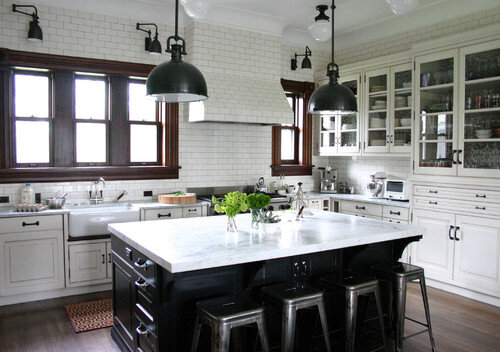
Now to be fair, I like black and white kitchens…when they are done right. Like this one. I’ll take this one any day:
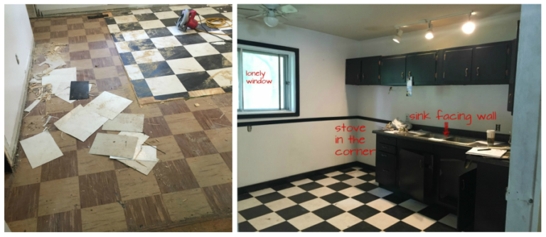
But not only were these cabinets gross and the floor smelly and breaking apart – the layout was wrong. Don’t you agree? Why use only one wall of a kitchen?
And I can’t imagine anyone would CHOOSE to work at a sink facing a wall – especially with a window just around the corner.
So we decided the layout had to change. This cost a bit more since water and power had to move, but I believe it will be well worth it in the end.
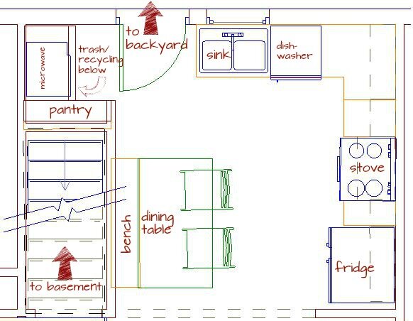
Our new layout looks like this:
You’ll notice that the sink is going to be under the window facing the backyard. Next to the sink there will be a dishwasher, and then a corner cabinet. The side wall will have a few more small cabinets, the stove, and a generous space for a fridge. This wall will also get a few upper cabinets and a custom hood built over the stove.
But what about the microwave, you ask? Ah, yes. Can’t forget the microwave. I really didn’t want to put it over the stove for several reasons. Aesthetically I just do not like the look. No judgement if that’s what you have. Really, I mean it… our house has it over the stove (that’s how it was when we bought our home) – so no judgement. The other reason I didn’t want it up there was that I really feel the venting capabilities of the microwave vent are just sub-par for anyone who cooks a lot. So the microwave needed a different home. We found the perfect spot back where the basement stair entrance and yard entrance used to be (remember, we’re moving the back door and flipping the stairs, which makes this possible).
This nook will now have a countertop for food prep/coffee station/large appliance home, shelf for the microwave, space below for trash, and a shallow pantry to the left of it all for additional storage.
I’m pretty pleased with how a “useless” area of this kitchen will become a highly useful spot that serves several important functions.
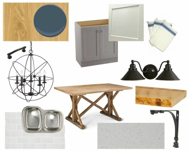
Beyond function, the kitchen will get a new look. I chose maple shaker style cabinets in a two tone finish – soft gray for the bottom cabinets and white for the uppers. We have quartz countertops coming and they’ll be installed with a large undermount sink – both upgrades I love in my own home and recommend to design clients often! The floors will be new wood floors that will flow seamlessly into the original wood floors throughout the rest of the house. At this point I’m thinking of putting in a subway tile backsplash and I’ve ordered some pretty lighting to place over the table and the window. Some functional can lights will illuminate the rest of the kitchen.
And since we’ll be adding a bench seat and dining table in this space, we’re also considering making that side of the kitchen shine by adding some shelving and a pop of color above the dining bench.
Here’s a collection of (most of) the pieces and parts that will make up the finished look of the kitchen.
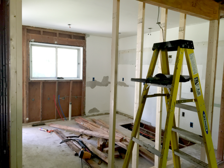
I’m telling you, I can’t wait to get this kitchen pulled together! We’re not there yet (just to keep it real see photo below of how the kitchen looks at this very moment)…but I can see it in my head and feel confident it will be a definite selling feature of this little home!

